The JBX Homepage Review

A free written homepage review for service businesses.

Get a concise mini-report showing where clarity, trust, or the next step may be breaking down - and what I would address first.

Written feedback. No call. No obligation to hire JBX.

The six-part JBX Homepage Review Rubric.

A useful homepage review goes beyond taste. The rubric follows the questions a visitor is already asking: Do I understand this? Do I believe it? Can I comfortably take the next step?

What visitors understand

The first three checks ask whether the page makes the business, its value, and the next step easy to recognize.

  1. 01

    First-screen clarity

    Can a new visitor understand what the business does, who it helps, and the result or next step within the first screen?

    I review the primary promise, audience recognition, supporting copy, message hierarchy, and how much the visitor has to infer.

  2. 02

    Offer & value communication

    Does the homepage make it obvious what the business sells and why a visitor should care?

    I review the offer, outcomes, differentiators, useful price context, competing services, and whether the page communicates value instead of only capabilities.

  3. 03

    Decision path & CTA

    Is the next step obvious, low-friction, and appropriate for the visitor's stage of awareness?

    I review CTA prominence and wording, competing actions, form or booking friction, what happens after the click, and nearby objections.
What visitors believe and can use

The next three checks look for the signals and usability details that determine whether the promise feels credible and comfortable to act on.

  1. 04

    Trust & credibility

    Does the homepage make a legitimate business feel established, specific, and believable?

    I review proof placement and specificity, supportable credentials and claims, visual quality, imagery, and missing context that could create doubt.

  2. 05

    Visual hierarchy & perceived quality

    Does the page feel intentionally designed, easy to scan, and aligned with the quality of the business?

    I review typography, spacing, imagery, rhythm, consistency, mobile composition, and whether the page feels templated, outdated, cluttered, or obviously AI-generated.

  3. 06

    Mobile, usability & friction

    Can a real visitor use the homepage comfortably and complete the next step on a phone?

    I review tap targets, navigation, form usability, readability, overflow, performance friction, overlays, animation dependence, and obvious accessibility blockers.

Useful enough to act on. Focused enough to arrive quickly.

The free review identifies the highest-value homepage issues and gives you a sensible first action. It is not a disguised sales call or an intentionally vague teaser.

At the center of the review3-5

Prioritized findings

What I noticed, why it may create doubt or friction, and what I would change first.

Opening summary

The homepage's biggest overall opportunity.

Useful annotations

Screenshots only when they make the feedback clearer.

Priority order

Which issue to investigate first, second, and third.

24-48 hour delivery

A written reply with no call required.

What this review is - and is not.

This is

A written first-pass evaluation of one homepage, focused on clarity, trust, offer communication, decision path, visual hierarchy, and mobile friction.

It is intended to show the highest-value issues to investigate first. You can use it yourself or share it with another designer or developer.

This is not

A complete redesign, technical SEO audit, GEO/AI-search audit, legal or compliance review, or unlimited consulting.

It is not a promise of rankings, leads, conversions, revenue, or another financial outcome.

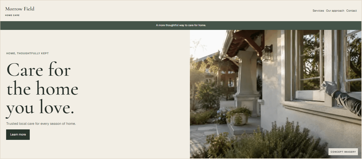
Concept example Fictional service business

See what a useful finding actually looks like.

This demonstration uses an original fictional business and homepage. It is not a client, testimonial, case study, or performance claim.

Original concept homepage created only to demonstrate the JBX review method. The numbered annotations correspond to the findings below.

Four findings, in priority order.

The first finding gets the most space because it changes how the entire first screen is understood. The remaining findings support that central correction.

01

First-screen clarity

What I noticed

The headline says "Care for the home you love," but the first screen never identifies preventative home maintenance or the homeowner it serves.

Why it matters

A visitor has to decode the offer before deciding whether it is relevant. The language creates mood, but not recognition.

What I would change first

Lead with the service and audience: "Preventative home maintenance for busy homeowners," then keep the warmer line as support.

02

Trust & credibility

What I noticed

The page claims "trusted local care" without showing who performs the work, what is included, or any verifiable proof near the claim.

Why it matters

Home access requires unusual trust. An unsupported reassurance may heighten doubt instead of reducing it.

What I would change first

Replace the generic claim with specific operating details and add only real credentials, guarantees, or customer evidence when available.

03

Decision path & CTA

What I noticed

The primary button says "Learn more," while the actual goal - requesting a home walkthrough - appears much later.

Why it matters

The button does not explain the commitment or what happens next, so ready visitors cannot confidently act.

What I would change first

Use "Request a home walkthrough" and explain that scheduling options arrive by email.

04

Mobile, usability & friction

What I noticed

On a phone, a promotional banner and oversized image push the service explanation and first useful action below the initial viewport.

Why it matters

The mobile page delays the information needed to understand and use it, even though nothing is technically broken.

What I would change first

Remove the banner from the first visit, reduce the image crop, and keep the service statement and primary action visible without scrolling.

Start here.

  1. 01

    Clarify the service and audience.

  2. 02

    Make the primary action specific.

  3. 03

    Add real trust context near the decision.

One submission. Three clear steps.

There is no discovery call, sales sequence, or implied paid commitment attached to the review.

  1. 01

    Submit your homepage

    Send the page and a few details about your business and goal.

  2. 02

    I review it

    I evaluate the page using the six-part JBX rubric.

  3. 03

    Receive the mini-report

    Get the prioritized written review within 24-48 hours.

After delivery

The review is yours to use.

Apply the recommendations yourself or share them with another designer or developer. If you want JBX to implement the changes or perform broader SEO/GEO work, I can scope that separately in writing.

No call required. No obligation to buy. Any paid work is approved separately.

Send me your homepage.

A complete submission gives me enough context to make the review relevant. Budget and timeline answers help frame the advice; they do not create a paid commitment.

Scope
One homepage
Response
3-5 prioritized findings
Timing
Within 24-48 hours

If you want help implementing what the review uncovers, I can scope the work separately. You are equally welcome to use the findings on your own or with someone else.

See JBX starting prices
Quick form

It takes about two minutes. The more you share, the more helpful the reply.

About you
About the project
A free, written reply, straight to your inbox.

Your info is only used to reply to you. Nothing else.

Before you send it.

The short version: it is free, written, focused on one homepage, and does not require a call or a later purchase.

Is the homepage review really free?

Yes. The first-pass written review is free. If you later want implementation, redesign, or broader optimization, that work is scoped and approved separately.

Do I need to book a call?

No. Submit the form and receive the review in writing. A call is not required before or after the review.

What kinds of businesses can submit?

The review is designed for service businesses, including B2B services, creator or personal-brand services, and home service companies.

How long does it take?

JBX aims to send the written review within 24-48 hours after a complete submission.

What will I receive?

A concise mini-report with an overall opportunity, 3-5 prioritized findings, what each issue may affect, what to change first, and annotated screenshots when they clarify the feedback.

Will you review the entire website?

No. This free review focuses on the submitted homepage. Other pages may be referenced only when they directly affect the homepage decision path.

Is this a complete SEO or GEO audit?

No. It may flag visible clarity, trust, usability, or search-related issues, but it is not a complete technical SEO audit or a complete GEO/AI-search audit.

Do I have to hire JBX afterward?

No. You can use the recommendations yourself or share them with another designer or developer.

Can JBX implement the recommendations?

Yes, if the work is a fit. JBX can provide a separate written scope for implementation or a broader website, SEO, or GEO engagement.